“Black Friday”, the day after Thanksgiving Day, marks the start of the holiday season for many retailers. Although it originated in the USA, Black Friday has quickly become one of the most popular shopping days of the year in countries around the world. The sale usually lasts for one day, but many stores offer pre Black Friday sales for the week before and continue their sales on Cyber Monday, the Monday following Black Friday.
Whether you decide to promote your sale through newsletter campaigns, social media or Adwords, it’s vital that your landing page is specific to Black Friday. We’ve chosen five of our favourite Black Friday landing pages from some of the world’s largest ecommerce websites to share with you. These tips and examples work well for all sales throughout the holiday season.
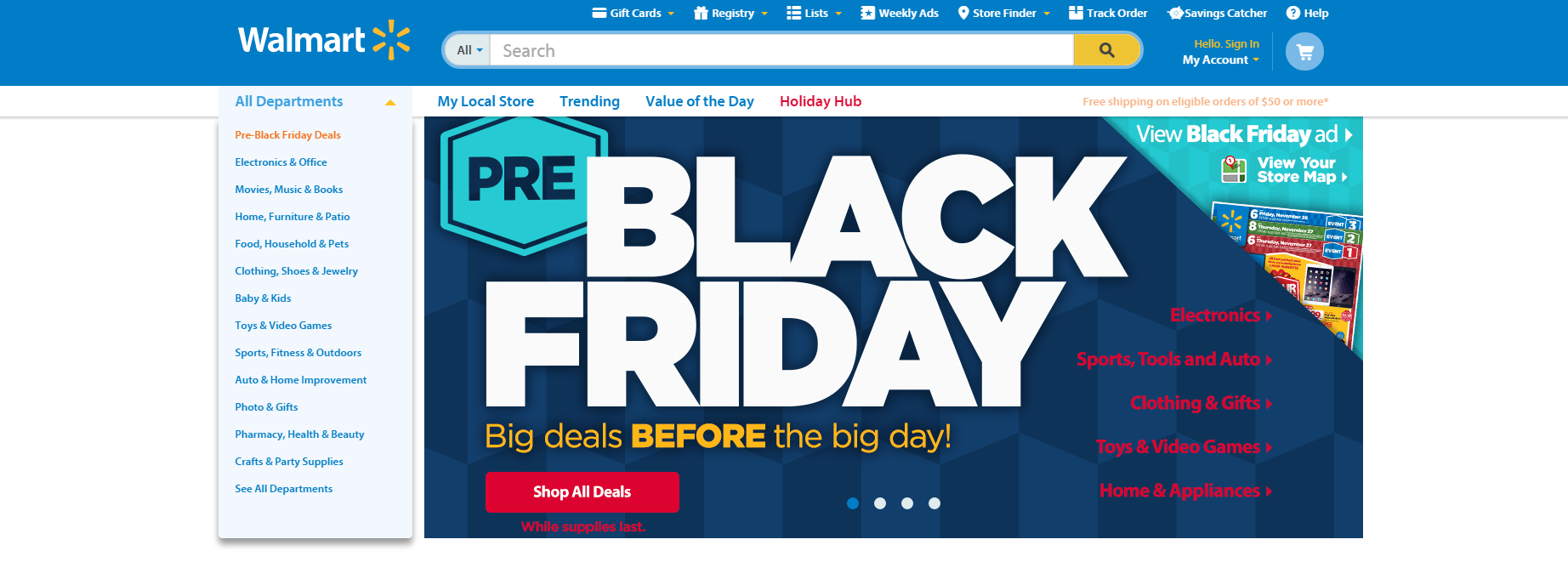
Navigation is key
One of the first ever companies to promote Black Friday sales, Walmart’s home page currently features a large, bold and engaging banner. The banner, designed to promote pre Black Friday deals, cleverly lists popular product categories which take customers directly to their Black Friday deals. At the left of the banner, they have their standard navigation bar with “Pre Black Friday Deals” listed at the top - the stand out colour ensures that customers will be drawn to the offer pages. Rather than removing all navigation from your landing page, simply draw attention to the pages that you most want your customers to visit. By having navigation options on your banner, customers are likely to notice them immediately and click through to those pages.
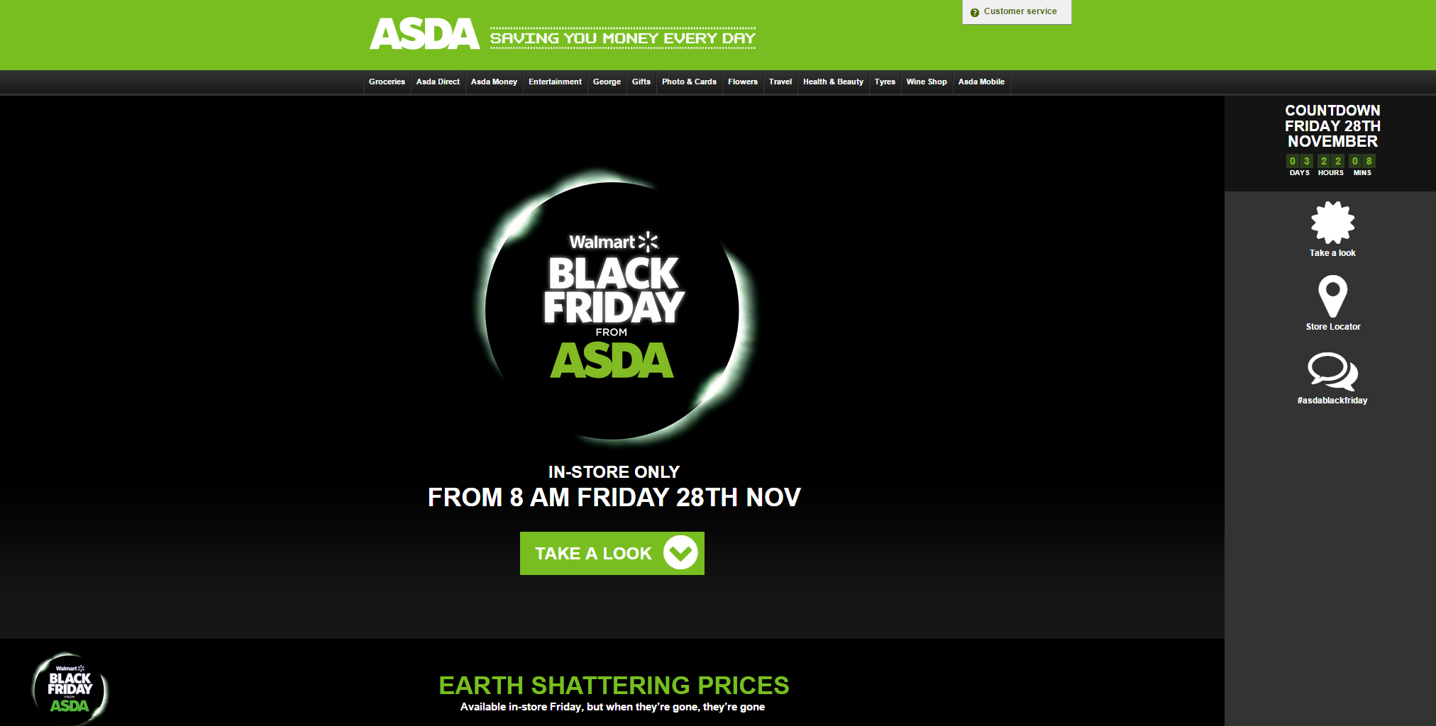
Use as much of your page as you can
When it comes to drawing attention to your sale, nothing works better than using your entire landing page for your banner. Walmart’s British cousin, ASDA, does this exceptionally well. By having such a strong contrast between the black background and the white and green text, ASDA can quickly capture the attention of any customers who arrive on their Black Friday specific landing page. As the banner takes up the vast majority of the page, the customer is drawn to the “Take a look” call to action instead of being distracted by unrelated images or text. This is perfect for ecommerce store owners who choose to create a dedicated landing page for their Black Friday, Cyber Monday, Christmas or New Year’s sales.
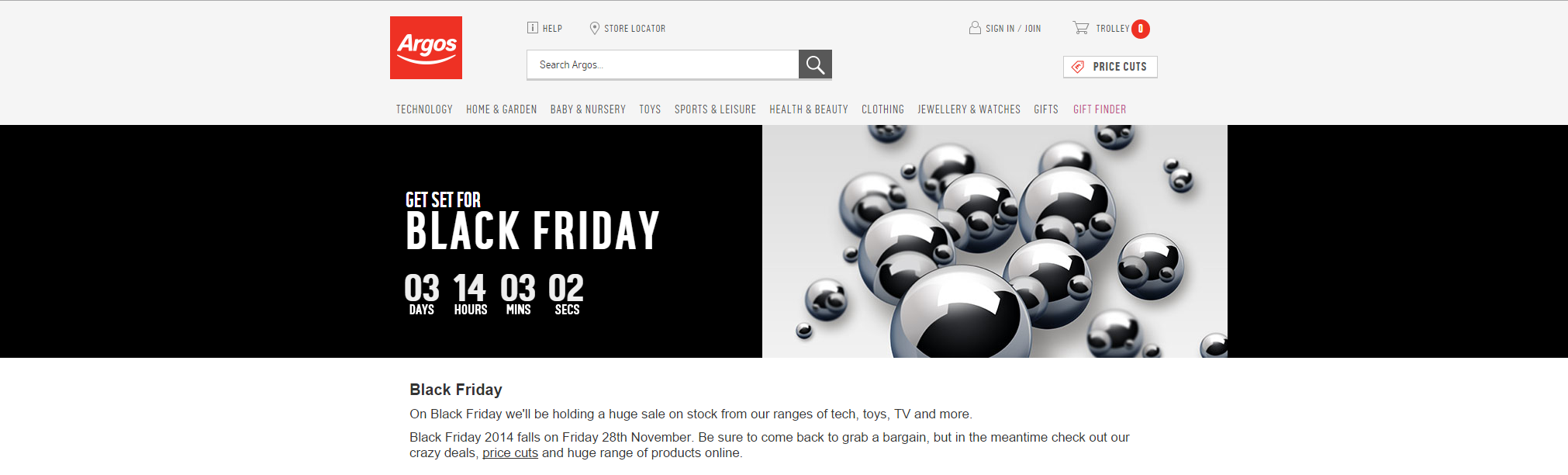
Create a sense of urgency
Nothing creates a sense of urgency like a countdown. The simplicity of this page draws all attention to the moving countdown and emphasises when the sale is running. By explaining that the Black Friday sale is for one day only, Argos has given customers a reason to come back to their website. Argos has cleverly chosen to include a link to their ongoing sales for customers to browse whilst they are waiting for Black Friday - this helps to keep visitors shopping in the lead up to Black Friday.
Keep all banners and offers above the fold
As one of the busiest shopping days of the year, you customers are going to be visiting not only your website but your competitors websites too. It is important that your customers see your best offers and prices as soon as they land on your page. Make sure that all of your best banners, offers, giveaways and deals are positioned above the fold and are clearly visible as soon as your website loads. Having deals positioned well will turn window shoppers into paying customers.
Offer exclusivity
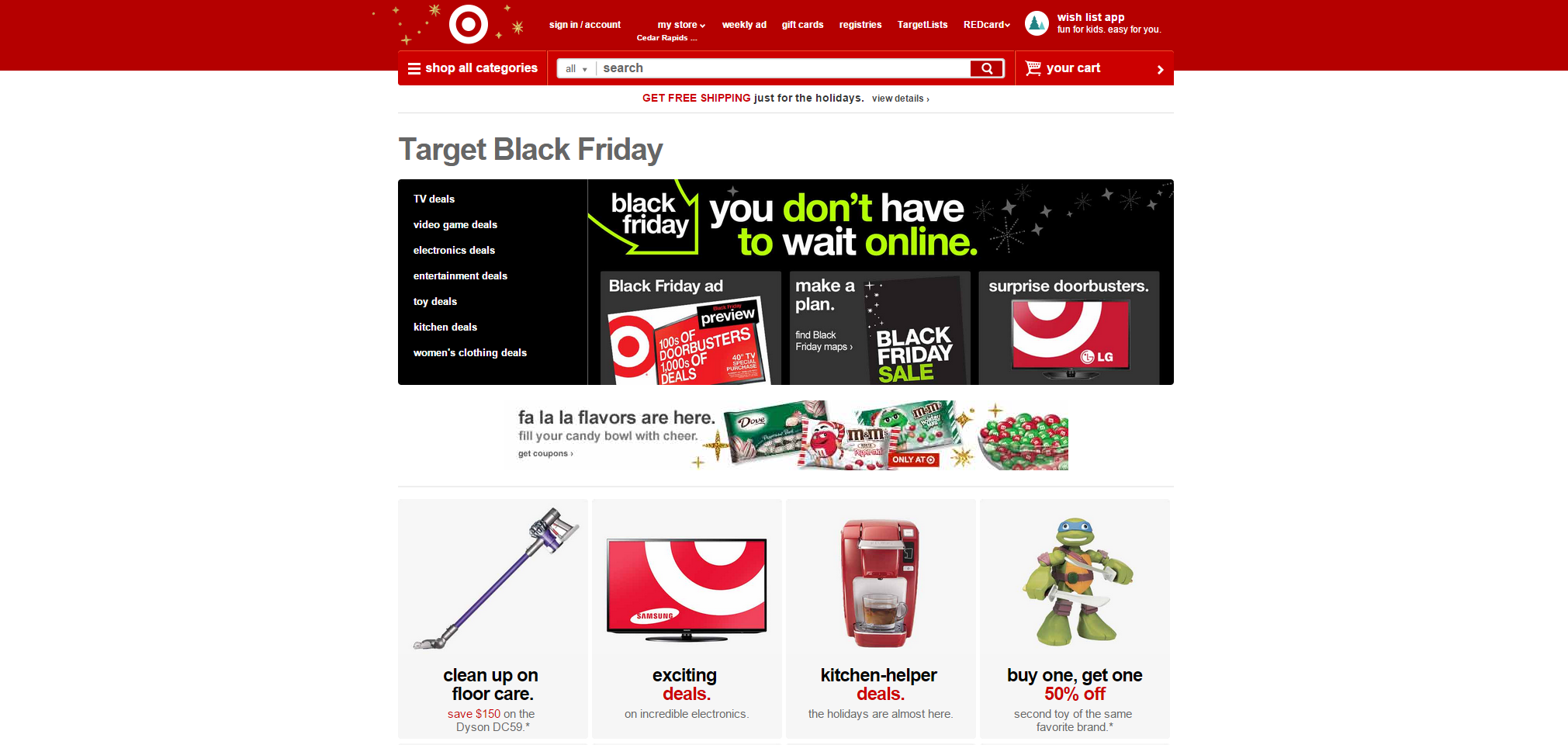
Everyone likes to feel like they are part of an exclusive group. By giving visitors a sneak peek at your Black Friday sale before it goes live on your website or before it is available in your store will give your sale an exclusive feel and lets customers pick out their favourite items before the sale has even begun. Target’s large banner includes the text “you don’t have to wait online”, along with an arrow that effectively directs the visitor’s eye to features such as their ‘Black Friday ad’. This simple 6 word sentence will appeal to a customer’s curious side and make them want to see the deals before everyone else.
Conclusions
You can improve your Black Friday landing pages in no time at all by following these simple tips.
- Make it easy for your customers to navigate your page, but draw attention to specific sale pages by featuring them on your banners and at the top of your navigation bar.
- Try to use as much of your landing page as possible to make sure that visitors to your website notice your Black Friday sale as soon as they arrive at your site.
- Create a sense of urgency by using countdowns and promoting the limited lifespan of your sale.
- Place your most attractive offers and banners above the fold to ensure that they’re seen as soon as someone visits your site.
- Give your sale an exclusive feel by offering your customers a sneak preview of your deals before they go live.
Remember, these simple tips can work for all sales. Putting these ideas in place for your Black Friday, Cyber Monday, Christmas, Boxing Day, or New Year’s sales will ensure that you make more sales than ever this holiday season.
Do you have any tips on how to optimise your landing pages for the holiday rush? Leave them in the comments!


Login and write down your comment.
Login my OpenCart Account