TModern multi-module Opencart Theme (Free Installation)
")
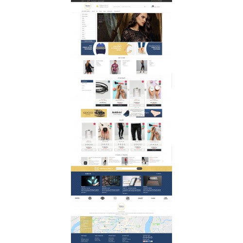
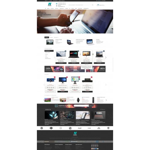
Responsive, multi-module template (constructor) for an online store based on Opencart. Thanks to customers, it has been developed and improved over the years. It has obtained a vast amount of improvements, such as many settings for appearance and functionality; a large number of modules have been added. It is in accordance with all coding standards, user-friendliness and of course search optimized.


Main advantages
1. Quick installation (in a few *mouse* clicks).
2. 4 variants of the template with the setting of each component through\via the admin panel.
3. More than 300 settings through the admin panel.
4. Additional resolution for large monitors.
5. User friendly (usability). A well-designed mobile version and full adaptability.
6. SEO optimization (micro-markup, tags, linking, url ....).
7. Speed and "purity" of the code.
8. Compatibility with popular modules (described in more detail below).
9. Lazy loading of "heavy" photos, videos and maps ...
Modules in a template
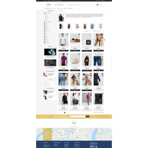
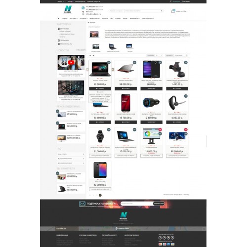
+ Category "Wall" (2 types of displaying categories).
+ News (news block or articles with the possibility of adding video and displaying related products and articles).
+ Store reviews (a separate page for store reviews and the ability to display them on the main page with an average store rating).
+ Blocks of products with a carousel (latest, most viewed, recommended, specials, bestsellers - it is also possible to output it without a carousel).
+ Latest product reviews.
+ Cookies (module for warning about using the cache in the user's browser).
+ 2 pop-up windows (a window with a subscription "subscribe and get a discount" and a window with a banner of offers. Setting\Setup by days of the week).
+ Live search (instant search when typing a text by many parameters).
+ Callback request (module for requesting a call back to the user. Requests are displayed in the admin panel).
+ Module 5 in 1 (recommended, latest, bestsellers, specials, most viewed).
+ FAQ page (information and frequently asked questions page to raise user’s awareness).
+ Categories "Accordion" (categories in the left column with a graduated opening and indication of the category in which the user is located).
+ Newsletter subscription (with the ability to edit subscribers and send letters to them).
+ News list (additional widget for news or articles, which can be displayed in the left column).
+ Pop-up cart with recommended products.
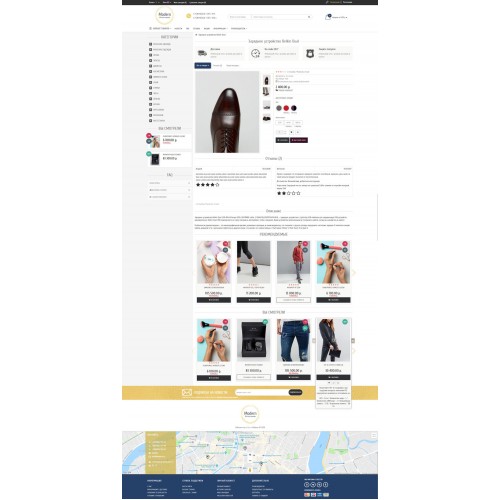
+ Quick view (module for quick viewing & selecting products and placing orders).
+ “Found a better price” (user request if they want to buy from you but found cheaper. For a discount. Requests are displayed in the admin panel).
+ Pop-up window with information about the product (dimensional grid).
+ Quick order.
+ Setting of all columns and convenient placement of orders in the admin panel
+ Points (pros and cons; advantages and disadvantages) have been added in product reviews
+ Creation of additional tabs in the product page.
+ Back in stock notification (automatically informs the user when the product for which they subscribed is back in stock. Requests are displayed in the admin panel. If the product is out of stock, the "Buy" button is replaced with "Back in stock notification"). “Inform when back in stock”
+ Fixed menu while scrolling.
+ You viewed (module with products that were viewed by the user earlier).
Basic appearance settings
4 template options. Each component of the differences between variants is configured in the admin panel. you can create hybrids of template options that are presented here By combining the appearance settings (for example, you can select the first template option, then through the admin panel change the orientation of additional photos in the product page from horizontal to vertical as in the second option, etc.)
+ Creation of additional items in the horizontal menu.
+ Open / closed version of categories in the horizontal menu of the site.
+ Configuration of the hidden categories for all screen resolutions in the open categories menu.
+ 2 options for displaying banners with adaptation to the open menu.
+ Additional banners in the middle and at the bottom of the main page.
+ Site description in the footer.
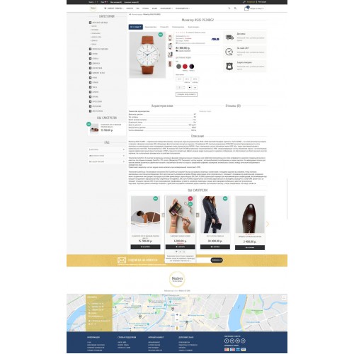
+ Setting up contacts on the map.
+ API map or using iframe insertion (google map).
+ “Show all” button for long descriptions in product categories.
+ Placing of the description in a category page is possible down / up.
+ Display of characteristics and descriptions when hovering mouse over the product.
+ Open or closed view of the map in the footer of the site.
+ Additional photos of the product (with lazy loading).
+ The choice of stickers is manual or automatic.
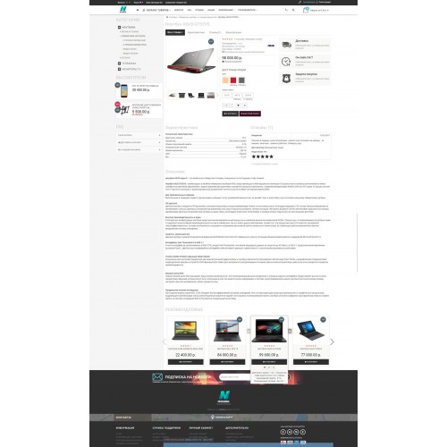
>+ Options with switching the main product photo in the product page.
+ Horizontal and vertical placement of additional photos in the product page.
+ Additional random review in the product page.
+ Switching the location of the "recommended" in the product page.
+ Information block (2 placement options) in the product page.
+ Zoom of the main photo of the product.
+ Promotion timer.
+ And many more less significant settings ...
Adaptability
Adaptability for each resolution from mobile to widescreen monitor is thought out in the template. We have added an additional resolution for widescreen monitors (now this is becoming a global trend, in bootstrap 5, which will be released in the future, there is already an additional resolution for large monitors, for many this will start working only in a few years, and we are a step ahead of everyone else, we have already provided this functionality).
Many nuances in the mobile version have been thought through, so that the visitor feels close to the "mobile applications" that are gaining popularity now, and at the same time, this view becomes more understandable for users (for example, a separate menu for the mobile version, which has a more convenient appearance specifically for mobile devices and which is additionally moved to a separate file for easy editing and much more).
The template is fully responsive, thought over to the last detail for different resolutions and devices.
SEO optimization (for search systems)
The template is optimized for search systems. Duplicate pages have been removed, tags are located correctly, all additional pages (such as news) have been added to the sitemap, support for shortened urls has been added for pages that the template creates, pop-ups do not affect the page code and do not create duplicates (pop-up data is created only at the time of their existence, product data is loaded via json), competent page linking, full-fledged micro-markup of pages, user friendliness (which is also a great part of success in a search systems promotion) and many little things that make the template optimized for a website promotion.
"Clean" code
You can check the correctness of the written code here link. This indicator demonstrates that the code is written in accordance with all html rules and, therefore, will be correctly "perceived" by a search engine and convenient for developers if you want to change something.
Technical support
3 Months Free Support
Main advantages
1. Quick installation (in a few *mouse* clicks).
2. 4 variants of the template with the setting of each component through\via the admin panel.
3. More than 300 settings through the admin panel.
4. Additional resolution for large monitors.
5. User friendly (usability). A well-designed mobile version and full adaptability.
6. SEO optimization (micro-markup, tags, linking, url ....).
7. Speed and "purity" of the code.
8. Compatibility with popular modules (described in more detail below).
9. Lazy loading of "heavy" photos, videos and maps ...
Modules in a template
+ Category "Wall" (2 types of displaying categories).
+ News (news block or articles with the possibility of adding video and displaying related products and articles).
+ Store reviews (a separate page for store reviews and the ability to display them on the main page with an average store rating).
+ Blocks of products with a carousel (latest, most viewed, recommended, specials, bestsellers - it is also possible to output it without a carousel).
+ Latest product reviews.
+ Cookies (module for warning about using the cache in the user's browser).
+ 2 pop-up windows (a window with a subscription "subscribe and get a discount" and a window with a banner of offers. Setting\Setup by days of the week).
+ Live search (instant search when typing a text by many parameters).
+ Callback request (module for requesting a call back to the user. Requests are displayed in the admin panel).
+ Module 5 in 1 (recommended, latest, bestsellers, specials, most viewed).
+ FAQ page (information and frequently asked questions page to raise user’s awareness).
+ Categories "Accordion" (categories in the left column with a graduated opening and indication of the category in which the user is located).
+ Newsletter subscription (with the ability to edit subscribers and send letters to them).
+ News list (additional widget for news or articles, which can be displayed in the left column).
+ Pop-up cart with recommended products.
+ Quick view (module for quick viewing & selecting products and placing orders).
+ “Found a better price” (user request if they want to buy from you but found cheaper. For a discount. Requests are displayed in the admin panel).
+ Pop-up window with information about the product (dimensional grid).
+ Quick order.
+ Setting of all columns and convenient placement of orders in the admin panel
+ Points (pros and cons; advantages and disadvantages) have been added in product reviews
+ Creation of additional tabs in the product page.
+ Back in stock notification (automatically informs the user when the product for which they subscribed is back in stock. Requests are displayed in the admin panel. If the product is out of stock, the "Buy" button is replaced with "Back in stock notification"). “Inform when back in stock”
+ Fixed menu while scrolling.
+ You viewed (module with products that were viewed by the user earlier).
Basic appearance settings
4 template options. Each component of the differences between variants is configured in the admin panel. you can create hybrids of template options that are presented here By combining the appearance settings (for example, you can select the first template option, then through the admin panel change the orientation of additional photos in the product page from horizontal to vertical as in the second option, etc.)
+ Creation of additional items in the horizontal menu.
+ Open / closed version of categories in the horizontal menu of the site.
+ Configuration of the hidden categories for all screen resolutions in the open categories menu.
+ 2 options for displaying banners with adaptation to the open menu.
+ Additional banners in the middle and at the bottom of the main page.
+ Site description in the footer.
+ Setting up contacts on the map.
+ API map or using iframe insertion (google map).
+ “Show all” button for long descriptions in product categories.
+ Placing of the description in a category page is possible down / up.
+ Display of characteristics and descriptions when hovering mouse over the product.
+ Open or closed view of the map in the footer of the site.
+ Additional photos of the product (with lazy loading).
+ The choice of stickers is manual or automatic.
>+ Options with switching the main product photo in the product page.
+ Horizontal and vertical placement of additional photos in the product page.
+ Additional random review in the product page.
+ Switching the location of the "recommended" in the product page.
+ Information block (2 placement options) in the product page.
+ Zoom of the main photo of the product.
+ Promotion timer.
+ And many more less significant settings ...
Adaptability
Adaptability for each resolution from mobile to widescreen monitor is thought out in the template. We have added an additional resolution for widescreen monitors (now this is becoming a global trend, in bootstrap 5, which will be released in the future, there is already an additional resolution for large monitors, for many this will start working only in a few years, and we are a step ahead of everyone else, we have already provided this functionality).
Many nuances in the mobile version have been thought through, so that the visitor feels close to the "mobile applications" that are gaining popularity now, and at the same time, this view becomes more understandable for users (for example, a separate menu for the mobile version, which has a more convenient appearance specifically for mobile devices and which is additionally moved to a separate file for easy editing and much more).
The template is fully responsive, thought over to the last detail for different resolutions and devices.
SEO optimization (for search systems)
The template is optimized for search systems. Duplicate pages have been removed, tags are located correctly, all additional pages (such as news) have been added to the sitemap, support for shortened urls has been added for pages that the template creates, pop-ups do not affect the page code and do not create duplicates (pop-up data is created only at the time of their existence, product data is loaded via json), competent page linking, full-fledged micro-markup of pages, user friendliness (which is also a great part of success in a search systems promotion) and many little things that make the template optimized for a website promotion.
"Clean" code
You can check the correctness of the written code here link. This indicator demonstrates that the code is written in accordance with all html rules and, therefore, will be correctly "perceived" by a search engine and convenient for developers if you want to change something.
Technical support
3 Months Free Support
Price
$39.00
- Developed by OpenCart Community
- 3 Months Free Support
- Documentation Included
Rating
Compatibility
3.0.1.1, 3.0.1.2, 3.0.1.3, 3.0.2.0, 3.0.3.0, 3.0.3.1, 3.0.3.2, 3.0.3.3, 3.0.3.5, 3.0.3.6, 3.0.3.7, 3.0.3.8
Last Update
5 Jul 2022
Created
18 May 2022
0 Sales
0 Comments

Login and write down your comment.
Login my OpenCart Account