Once you create the perfect look and layout of your product page, your eCommerce website will be all set to start bringing in revenue. However, you have a lot to do, test and optimize until you reach the promised land of high profits.
What are the must-have elements to include in the design of your product page? How to arrange the various components such as images and information? How to style the text and buttons?
Let’s take a look at ten examples and analyze what are the methods adopted by these stores.
Product name
Make sure it’s clear and descriptive enough
It’s always better for your product’s name to fully describe the item so that the customer knows exactly what it is, what it does or what it’s used for.
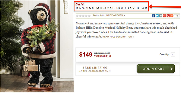
In the example we have from Balsam Hill, you see that the full name of the item is not just “Dancing Bear”, but “Dancing Musical Holiday Bear.” This fully explains the product because from the name we know that it’s not only dancing, but also musical, and for the holidays. And it’s a bear!
The product name is also an opportunity to gain some extra SEO points because people often look for specific things and you have a bigger chance of conversion with long-tail keyphrases than standard keywords like “Dancing Bear.”
Images and Video
High-resolution, 360°, captivating presentation
The question on every customer’s mind is what the product is and how it looks like. The choice is made when a user sees the product and decides if this is what they need, want or are looking for. The rest of the product page elements are there to enhance user experience and guide customers to checking out.
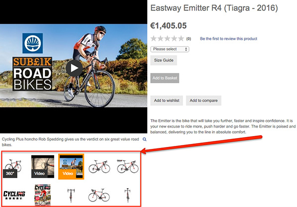
Wiggle demonstrates how they show their bike from all possible sides, including a 360 degree rotating image. They have also added a couple of videos of how the bike is used and posted a cover picture of a magazine featuring the model. This helps the people interested in the bike associate themselves with the product better and imagine using it, which a strong selling point.
Rating, Reviews and the Social Default Bias
Persuade users with testimonials & popularity
Having a section dedicated to the rating of your product as well as customer reviews is a must for every web store because 61% of users read testimonials before making up their mind. Customers who are unsure of the choice tend to copy other’s decisions. This means that if you have two products and one of them has been bought once, there is a huge chance that the person viewing them will consider making the same choice.
Depending on the exact product, public opinion is very important for customers because they want to know whether the product works, how it works, does it fit them, is the material of high quality, etc.
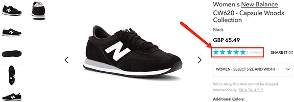
Shoes.com have placed their 5-star rating system right under the product’s price where customers will quickly see it and check the reviews. The light-blue color is not too intruding, but easily stands out.
Scarcity
Notify if the product is of limited quantity
A customer’s decision can be influenced a lot by the stock level of the product they are viewing. Furthermore, it can be influenced in all directions. If you suggest that your product is running low on stock, it is known to create a sense of urgency and customers might feel motivated to make the purchase quickly.
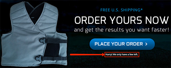
Kn3tx does not specify the exact number of vests they have left, but only indicate that they are “just a few”, which sends a message of urgency to customers who consider purchasing the product.
Whether you aim to influence the buyer’s mind or not, you must always specify the stock levels of your products because customers don’t want to find out upon checking out or receive a notification after they have made the order that the product is actually out of stock. Chances are, they won’t come back.
Call to Action
Pick the color triggering the correct emotion
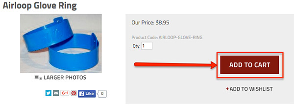
The psychology of colors can tell you a lot about how important it is to choose the colors in your product page carefully. You can’t just go picking a random bright color because the contrast will be high and the user’s attention will be instantly focused on the Add to Cart button. It doesn’t work that easy.
It’s better for the color to be different, like we see from Air Loop. Still, you have to determine if the emotions triggered by the button are the right ones for your ideal audience.
The CTA (Call-to-Action - a phrase, button, or other element that encourages activity for users) is the component that requires more testing and optimization than any other element in your product page. From the text in the button, to the color, position, size and form, there are a lot of variables you can tweak to reach the highest conversion rates.
The Price
Keep the flow with a pleasant appearance
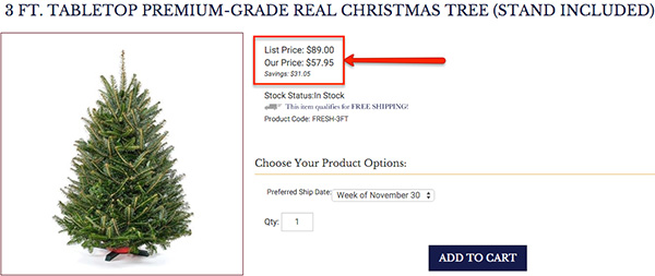
As with the CTA button, the price of the product plays a critical role in the decision that a person makes. Understandably, from a design and optimization perspective, we cannot control the numbers, but we can manipulate the styling, size, color and position.
Blue Ridge decided to go with a standard size and a non-intrusive pricing section, which is a good way to go because you don’t want the price to be in-your-face or displayed with huge numbers.
Edit Quantity
Next to your “Add to Cart” button for extra sales
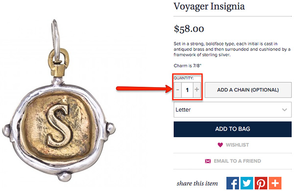
Let’s say you are selling a product that is consumable and might be good to buy a couple or more in a single purchase. If the customer can’t find an option to edit the quantity on the product page, it takes away from the user experience of your product page. Some web stores choose to have this option available at checkout, but it’s better to have it at both places for more convenience.
The place where Wax Insignia chose to put their quantity editing function is right above the “Add to Bag” button. They coupled it with two + / - buttons that are big enough to make it even more easier to edit.
Having this option available might help you get more sales out of a single product as it saves time for customers and helps them calculate their costs better, which is always a benefit.
Savings
Show estimated savings for discounted products>
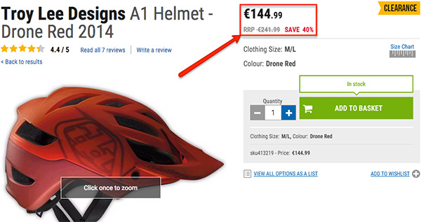
It’s natural for customers to want to pay less for the product they want. If you have discounted products or a general clearance, you have to calculate how much the users will save if they make the purchase.
You have two options. You can either do what Chain Reaction Cycles have implemented and that is the calculated percentage of the total price that customers will save. The other method is to simply estimate how much money will the customers save. In this case the alternative would be €97. Simply test what works better for your store.
When you do the math for your customers, they will not have to calculate it on their own, which takes time and that is the opposite of what they should be doing on your product page.
Shipping & Return Costs
Never give unexpected costs
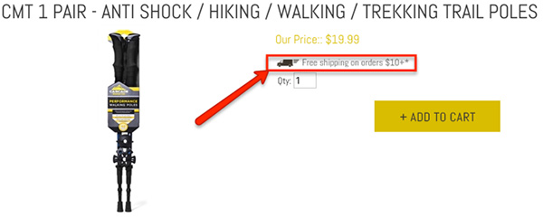
The #1 reason for customers to abandon their carts and never purchase is because they have noticed some unexpected costs upon reaching the final stages of the checkout process. You can guess why your product page cannot be missing this critical information.
Whether you will be offering free shipping on orders above a certain cost like Cascade are doing above, or you are simply showing how much the shipping for the item will cost, it’s up to you. Just make sure that the users can view the information before adding the product to their cart.
Return options and costs are always good to have because it can influence the customer’s decision. If it’s too costly to return the product in case they are not happy with it or find a flaw, they might decide not to purchase it at all.
Payment Methods and Credibility
Assure customers you are safe to work with
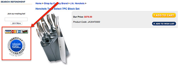
Secure payment methods are a must if you want your customers to shop from you with confidence. The fear from paying online is growing and users are insecure about making such transactions. That is why you must reassure them that your website is safe, you have secure payment methods and you have badges supporting your credibility.
A few more notable mentions
- Product descriptions. You have to include a written description that not only gives information about your product, but is also designed to sell it. It has to be concise and to the point, showing all of the benefits of the product and its value. Buyers want to know how it will change, improve or simplify their lives, so make sure to be as clear and descriptive as possible.
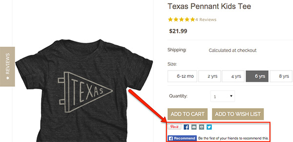
- Social media buttons. If you want to ride the waves of social sharing between users, you have to place the social media integration in a place where it will be easily visible and enable customers to share your product with their friends in a matter of seconds.
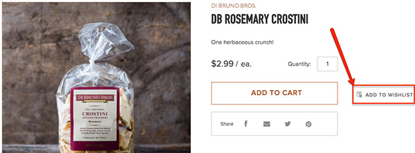
- Add to wish list. Some websites prefer to remove it, but others use it. It’s up to you whether to include this feature or not, but it certainly can be useful for users who might not be planning to make a purchase just yet, but they want to organize their preferred products and calculate their costs.
Conclusion
Testing and optimization should always be on your mind, and an indispensable part of the product page creation process. It’s easy to point out the elements that must be present in your eCommerce website and it’s also easy to implement them. However, their actual impact of these elements is in your hands. Your effort will determine how well your product page will do.
CREDIT: Mihail Savov
Mihail Savov is a content creator at iSenseLabs. iSenseLabs creates Premium OpenCart Extensions and Themes serving more than 20 000 clients around the world.
This blog post has been provided by iSense Labs. Please note that whilst OpenCart recommends iSense Labs, all views and opinions in this blog post belong to iSense Labs and are not those of OpenCart. OpenCart is not responsible for any opinions or claims made in this blog post.


Login and write down your comment.
Login my OpenCart Account